TRIP INTO JAPAN.
The quality works in the quality ambient
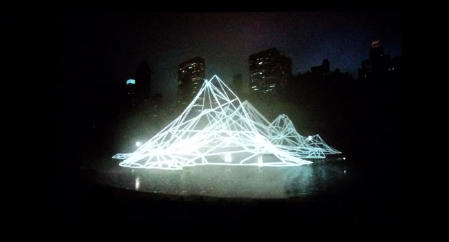
The modern art gallery where the works combining each other to make air of this gallery. Espace Louis Vuitton Tokyo is definitely one of it. It locats 7th floor in flag shop of Louis Vuitton. In gallery, don’t try to understand what it is in front of you instead feel it. All just came from my experience tho haha. Just by being said gallery, the theme of gallery is changed in certain period and this time was Pierre Huyghe’s work. Never heard him.. but every time this gallery doesn’t let me down after all so I get there often again and again. By the way I couldn’t take quality pictures because some works put in darkness..ok let’s see.
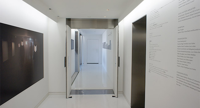
It appeared to be taking me into only two tones color room white and black. Feeling I’m in sort of transparent space. Even this gallery belongs to luxury brand building and supported by, it doesn’t look sumptuous. Except washroom! (try and see it if you get there lol)
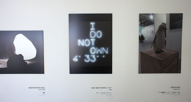
A couple of work on the wall as introduction for main room where I’m going to step in.
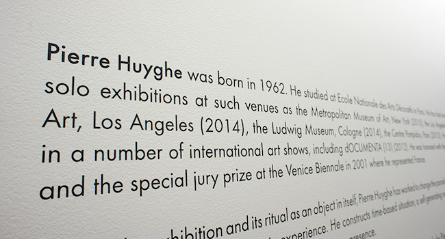
There is description in English on the wall as usual.
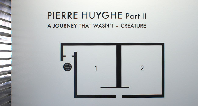
Map on the wall next to door entering to dark main room to this exhibition. Of course the design for space would change depending on theme and artist. Some is going to be like this or not I mean there is no wall in the middle.

I cut the movie out onto pic was playing at dark room. It might be best shot at this time.. To be honest some part was good but other wasn’t on movie tho.
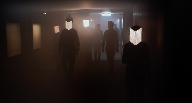
I found myself “how do I tell?” after saw this type of artwork. For example some people having light mask while walking and came out from darkness…but I like somehow.
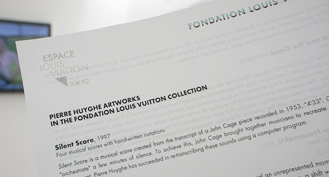
Brochure in English prepared next to Japanese one.
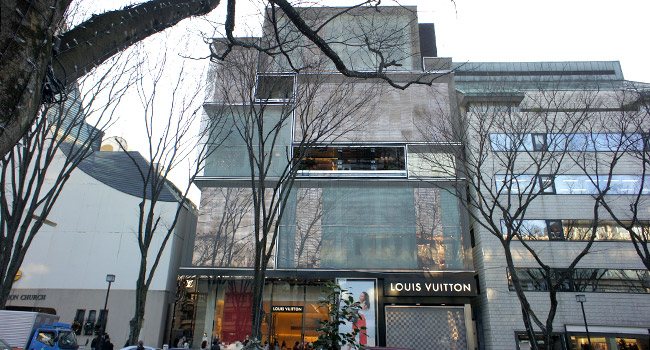
By the way Louis vuitton’s building stands where looks cramped. In other word, it locates one of well known shopping street.
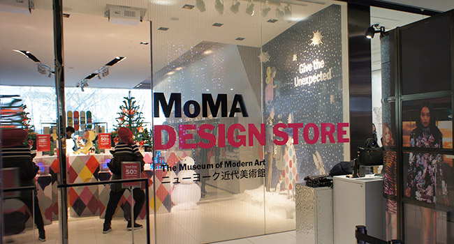
One thing that I would like to tell you is that there is MoMA DESIGN STORE minutes away from Louis vuitton’s building. You may encounter something good focusing on Japanese style. Don’t know MoMA? Umm, don’t let me tell further. haha
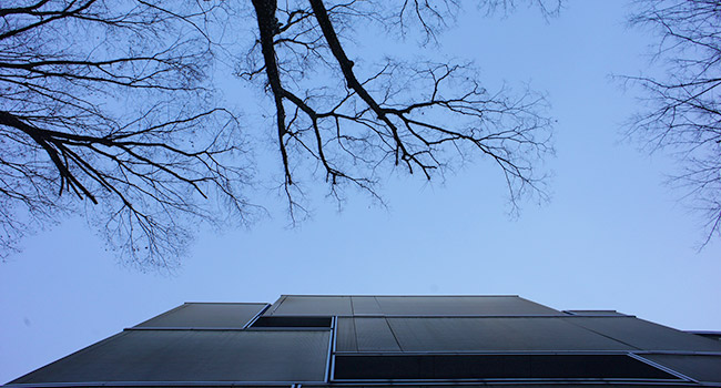
Done today and looked up sky. Even though sidewalk was crowded and busy, the blue above me was beautiful.
Like as I put down before (this article), there is a couple of galleries dedicated to luxury branding store where you might be spacing out like I was lol. Anyway I can tell that if you like following keywords I think I would have to say you put this gallery to your wish list. Keywords are… “Glass as material”,”black and white”,”texture of concrete” and “minimalism”. Enjoy your trip.
Do you have any questions? Leave comments below or contact me at contact page.